GoNetspeed
A Modern Brand Identity that Builds on the Past
Services
Team





In 2021, when six communications companies decided to bring together decades of experience across a range of technologies, the new company, known as GoNetspeed, came to Ethos for a modern brand identity—one that would leverage the legacy and strengths of each of the six companies.
With the new GoNetspeed now spread across the Eastern U.S., was it possible to create a new brand without cannibalizing the success of the old? For some, the integration may have seemed fraught with challenges, but we saw it as an opportunity to move forward. To go to another level. To build a scalable brand that appealed to multiple personas.

This is how technology that works feels
Faced with a variety of customers (residential and business, cable and fiber, phone and TV) from a variety of states (from Alabama to Connecticut to Maine), our first challenge was to find the unifying element that would connect them all.
After a deep dive into the situation, it hit us—customer aspirations are not limited by geography. Because no matter where we live, life is coming at us all just a little quicker than we can sometimes handle. Some thrive on it. Some don’t. To each their own. But what ties everyone together is the desire for technology that works—now and with whatever comes next.
With that insight, it became clear that instead of going the more traditional route of showing images of fiber optics and cables, what was needed was a brand and visual identity built around showing what technology doing what it’s supposed to be doing feels like.


Mapping the Future
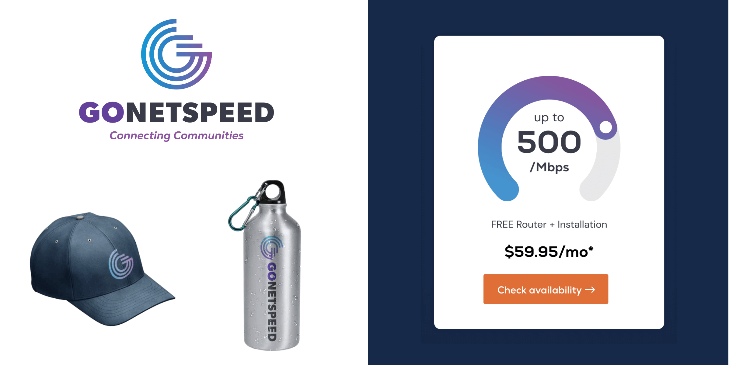
Over the course of the next year, Ethos developed new brand positioning, brand promise, and a new visual identity system. We also gave GoNetspeed a brand launch playbook, complete with a brand launch video they could use as they unrolled the new company.
In Search of a Better User Experience
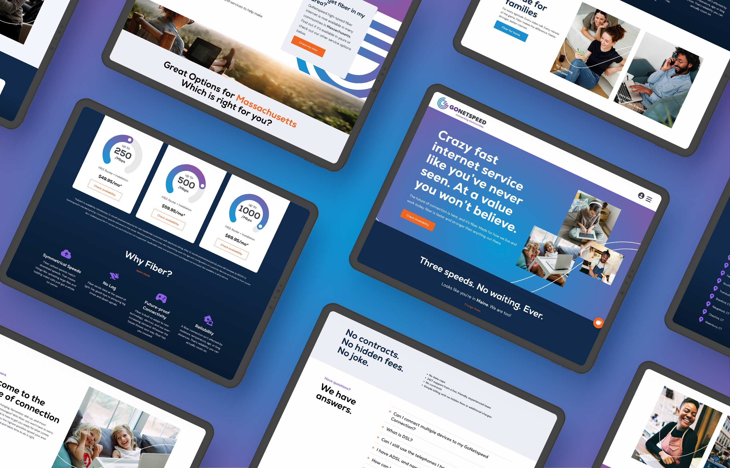
As the final part of brand development, GoNetspeed wanted a site that reinforced the new brand messaging, provided a better user experience, streamlined content and navigation, and was optimized for conversions and search engine rank. They also wanted a site that was easy to manage and maintain.
VONT’s immersion process provided a complete wish list from the client. With that in hand, a detailed Information Architecture map was created, which re-organized the existing content and navigation, making the entire experience more intuitive for the user. The creative team brought life to the content, while the programmers built the site on WordPress, ensuring it would be easily managed in the future.
